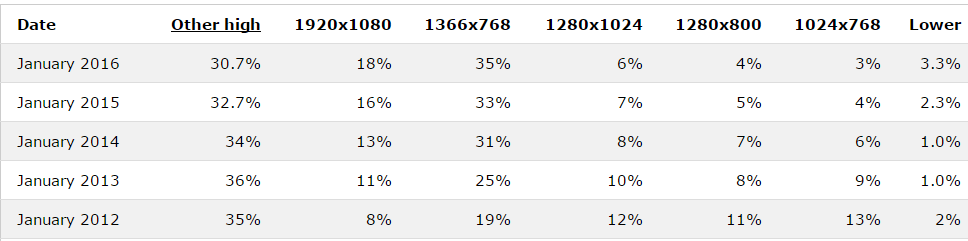
From the January 2016 statistics by w3schools, you can see the previous desktop standard of 1024 x 768 is now changed to 1366 x 768 as more desktop / notebook are using 16:9 ratio nowadays. And you can see 1920 x 1080 are gaining popularity too so if your website is going to be full width design, you will need a larger image to show clear message for your business as everything will be enlarge proportionally. If you are running boxed design, make ensure you are doing that from 1366 x 768 prospective to avoid too empty on the side when users are looking at your site with 1920 x 1080 screen.
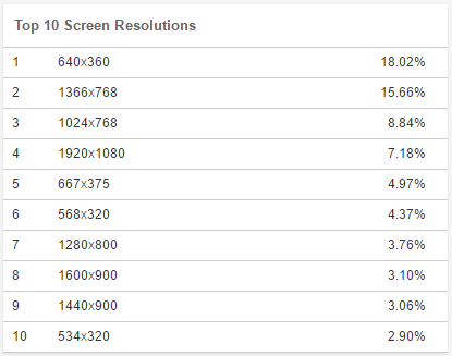
From the October 2016 statistics by w3counter, they are running the top 10 screen resolutions across all device from desktop to mobile and that’s why it is quite different to w3schools one. From the report, you can see many users are reading website content via mobile with landscape mode. But some similarity on the screen size popularity you could spot is that both 1366 x 768 and 1920 x 1080 are getting more attention. So if you are planning to do a website design, try to start with 1366 x 768 for desktop mode and of course since it is responsive design, it should have the ability to cater tablet mode (640 x 360 and 1024 x 768) as well as mobile view.